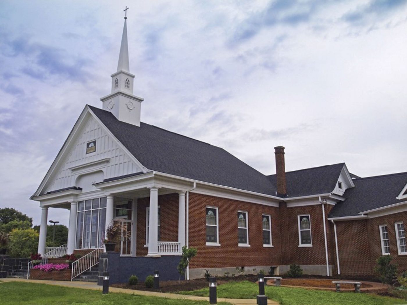
In 2009, a former client who had been a Building Committee chairperson for a church in Lynchburg, contacted Architectural Partners to request services after moving to a new area and becoming associated with another congregation. Based on his past experience working with our firm to solve challenging issues of church growth in historic buildings, he asked us once again to provide elusive solutions, this time for Bethlehem United Methodist Church in Moneta, VA.
The congregation at this small church was growing and running out of elbow room. All spaces were crowded, classrooms were limited, restrooms were too small, and existing hallways were entirely inadequate to handle the new numbers of people attending. In short, every function of the church was limited because of the building and its inability to handle expansion.
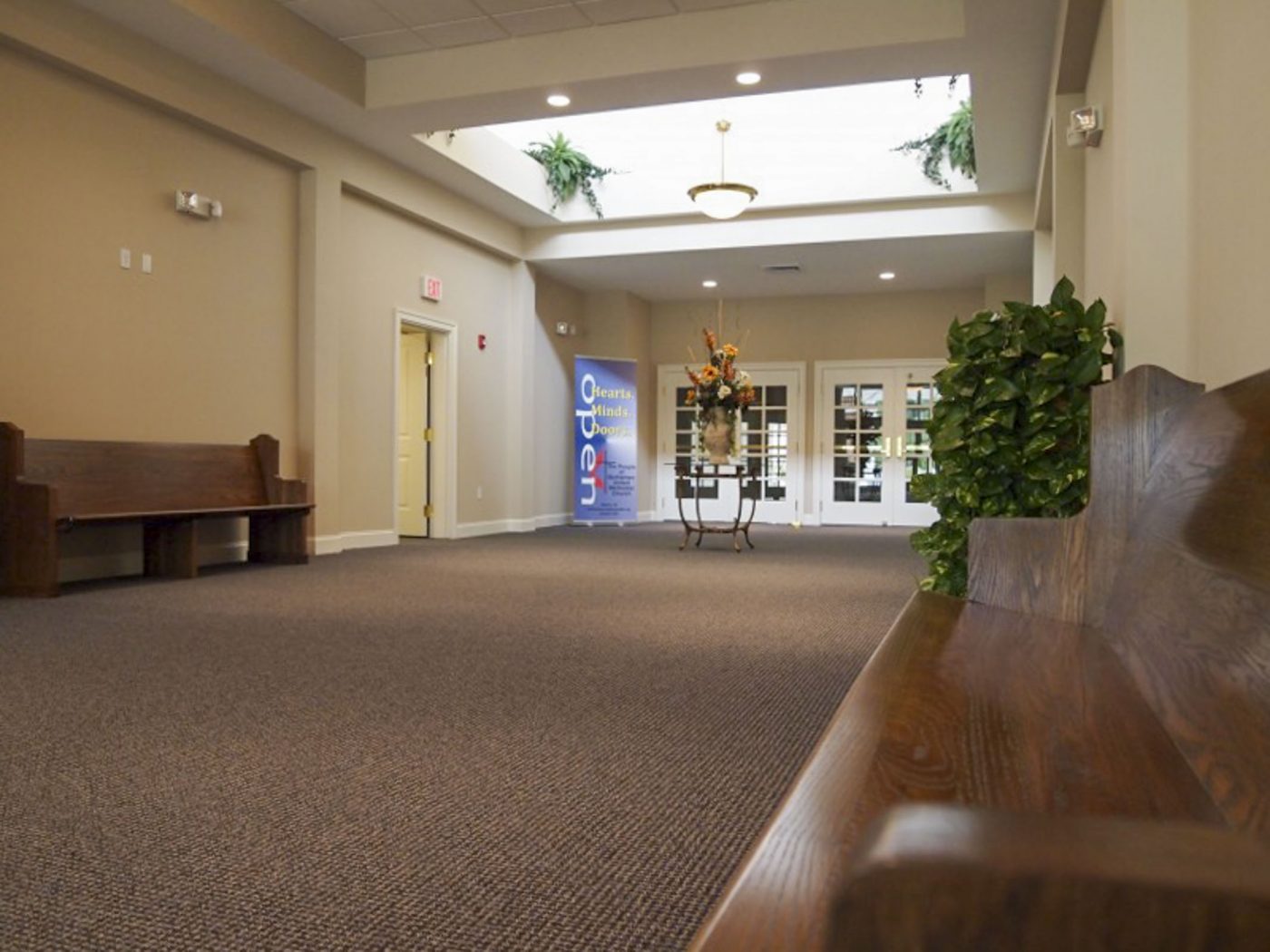
Architectural Partners began the process of finding a solution by producing a series of quick and rough plan explorations to study potential ways of allowing expansion. Key to all of the studies was the demolition of some cramped existing spaces immediately behind the sanctuary and the creation of a new wide narthex hallway that became the spine for connecting new and existing spaces while giving members room to visit and move through the building. The solution arrived at, tied this narthex into a covered drive on one end, and an expanded fellowship hall on the other. In between were connections to a new two-story classroom and administrative addition as well as the existing sanctuary.
The design-build process was very deliberately carried forward. After the design concept was finalized, construction budget estimates were received and approved. Then a general contractor was selected as a team member to assist with tracking costs throughout design. Construction drawings were completed in 2010. The final construction cost was then updated and approved. The selected general contractor completed the complicated work in 2011, working with the congregation to keep church services and a pre-school continuing without interruption.
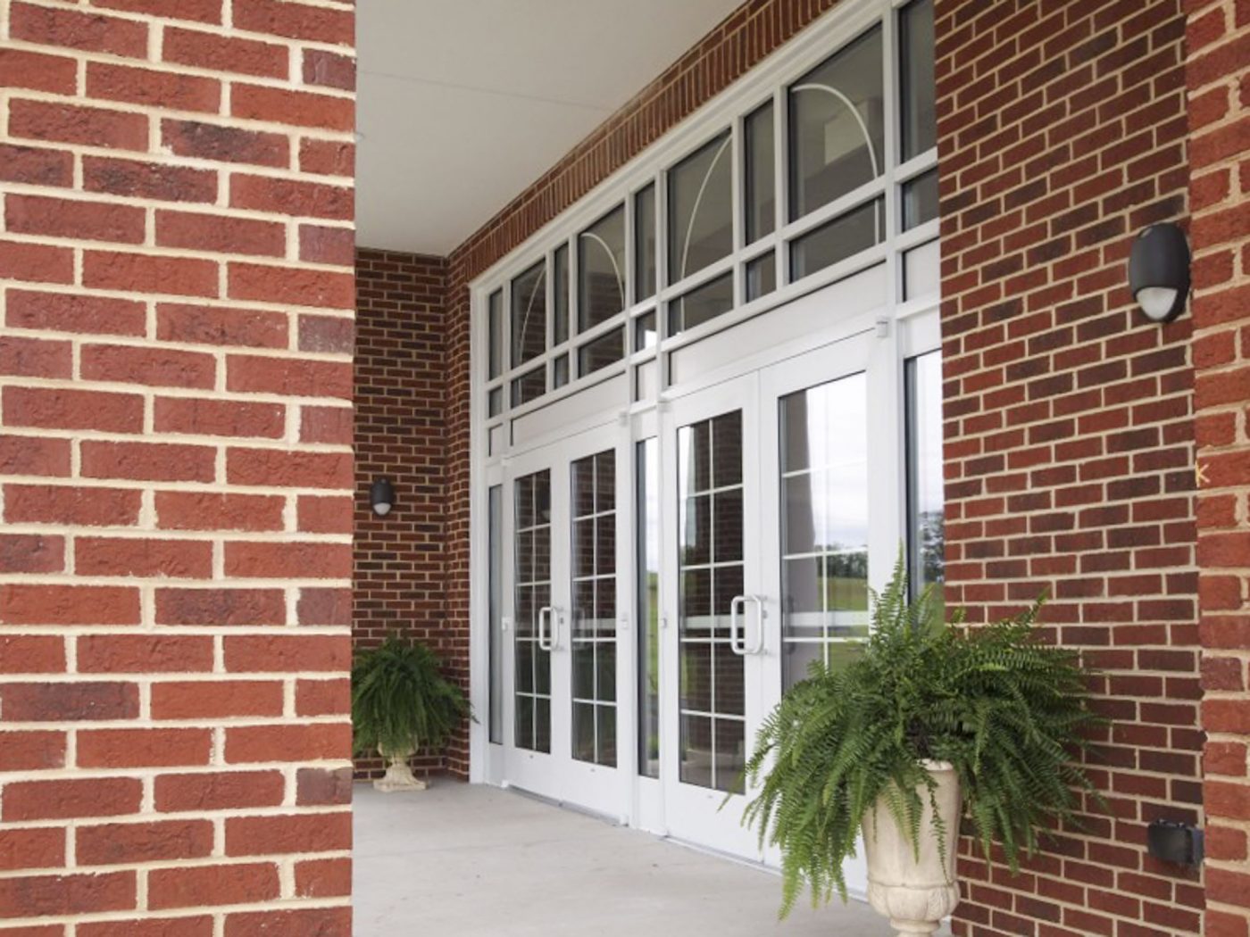
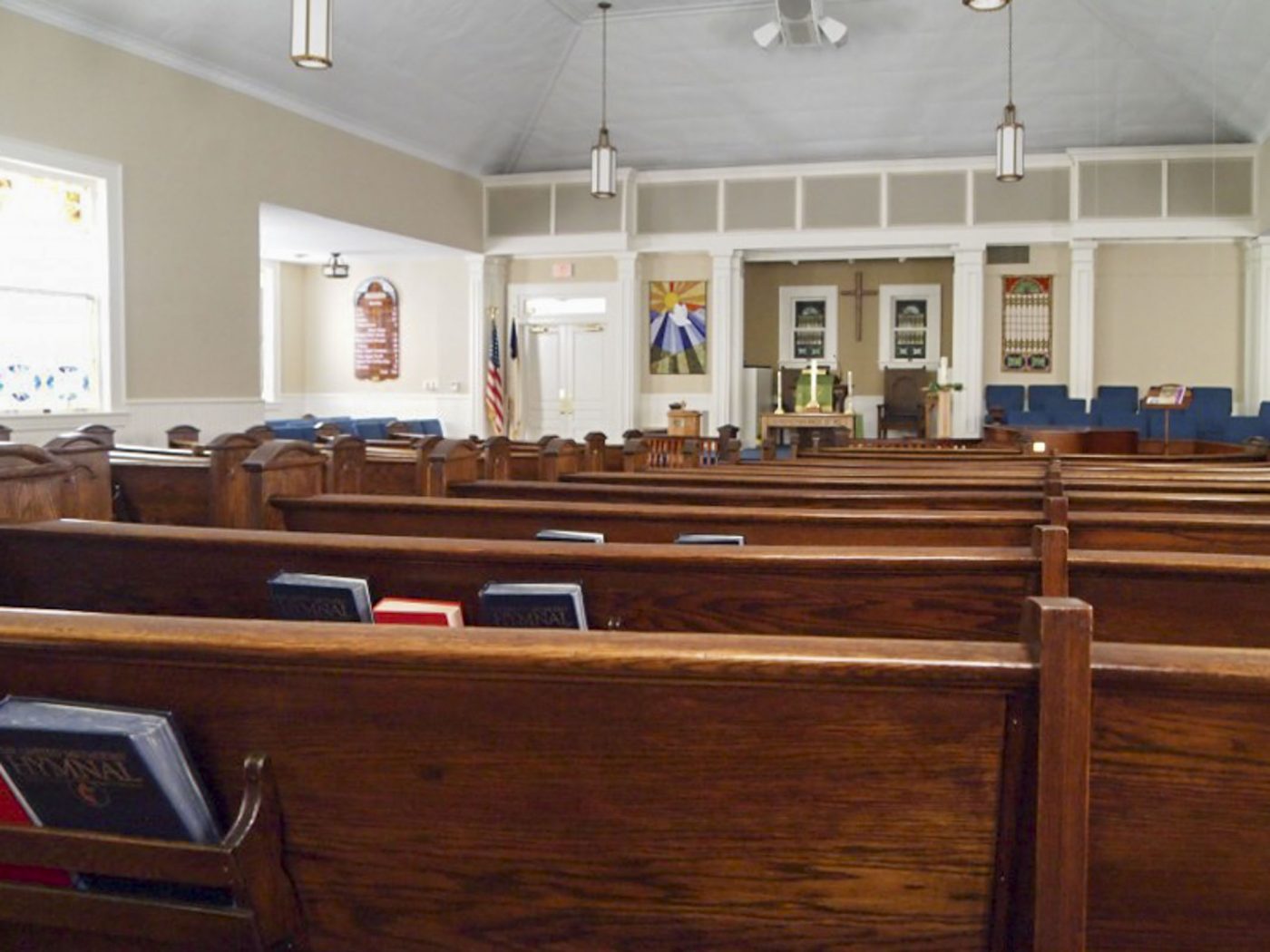
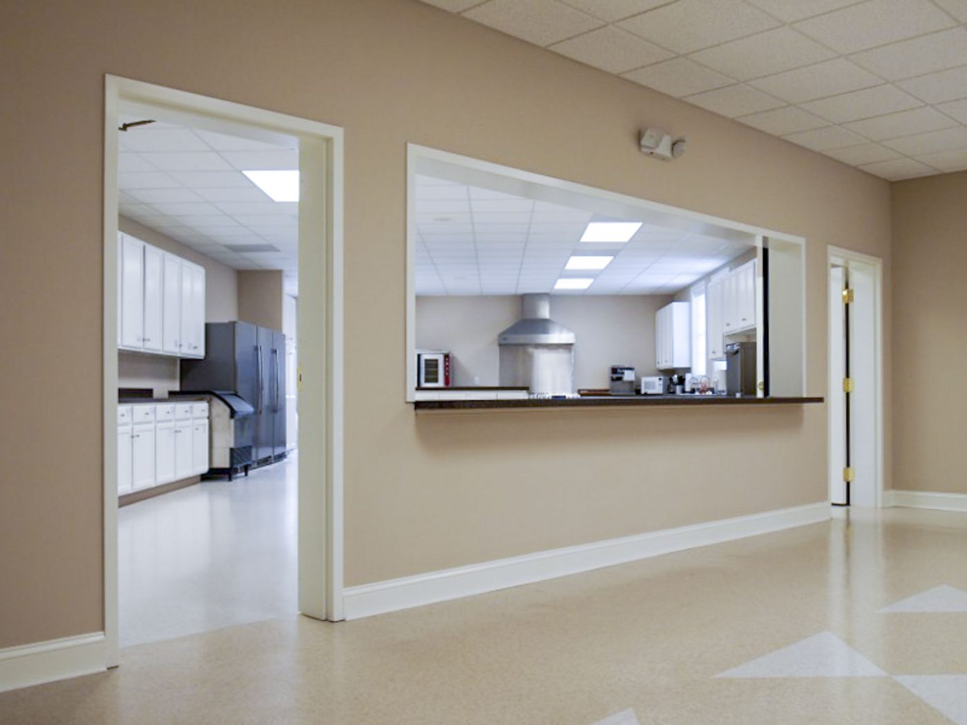
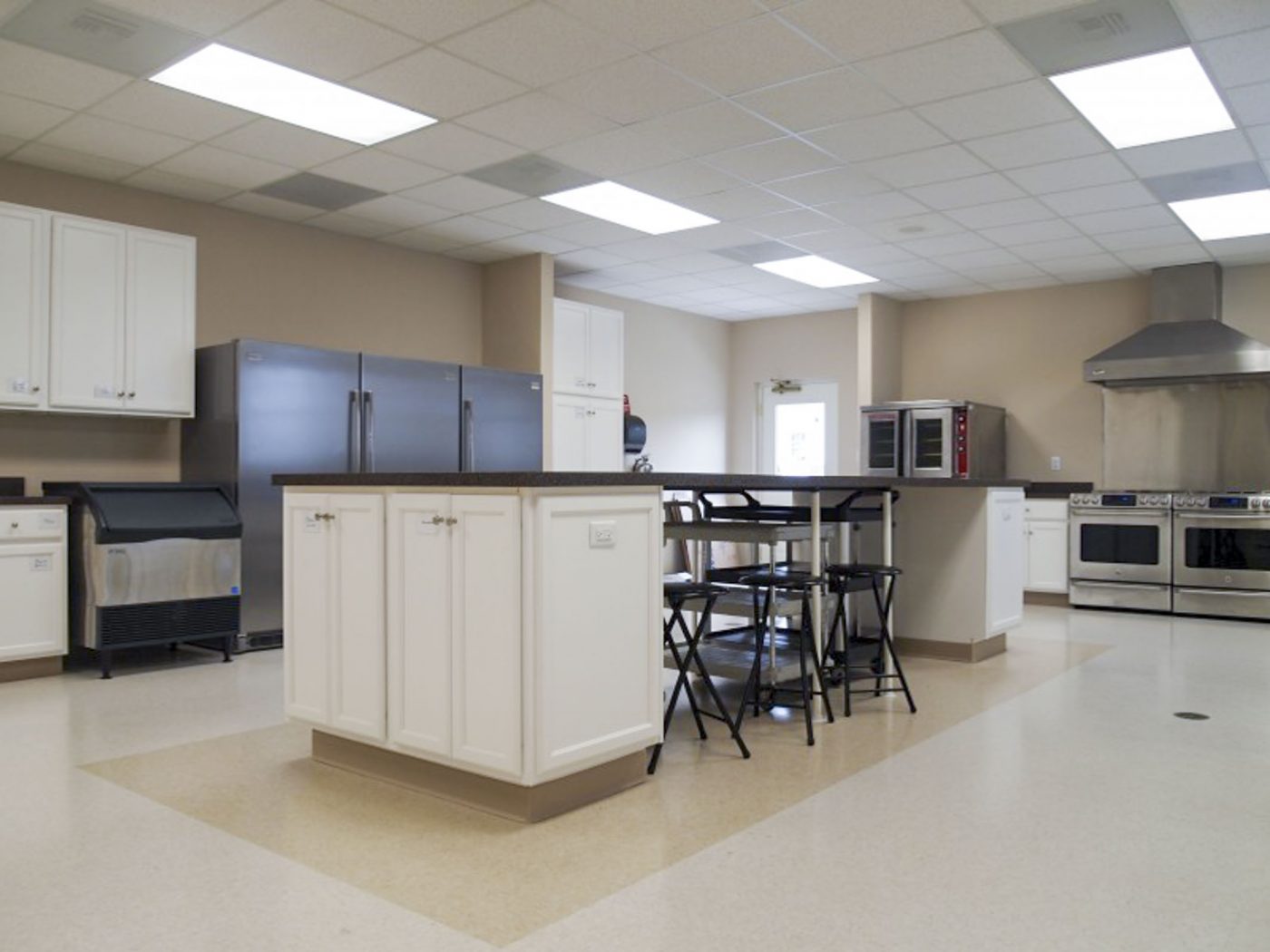
The final design tied together multiple angled wings. In addition to new classrooms and church offices, it incorporated a new choir room and robing room, a renovated kitchen, a new commercial elevator, and new receptionist and work areas near the new front entry. Similarly, the design of the additions visually tied new work to the historic sanctuary. The new Narthex is tall and wide and filled with light from clerestory windows deep into the plan. New beaded paneling repeats historic details and storefront construction allows plenty of view into all of the activity inside. The earlier labyrinth of hallways is gone and room is now available for current uses and future growth.